OK, well, I was pretty bad at not doing this last week. Hayfever is a right pain, and then I ended up staying at my folks longer, then my hayfever hit again, then someone called me up for a party which was unexpected. So yeah. I didn't get any drawings done. Whoops - I've done the Aquagirl one, but I ain't happy with it, so I'll probably end up redoing it. And I haven't started the Question one yet, but I've got it planned. So apologies to my loyal readers, I'll jus do a couple of quick three sentence or less reviews to appease ya all (and I'm totally not stealing X's idea at all) :D
Atlas #2 - an improvement over last months effort, though still not a fan of the 'Zombie' storyline at the back of the book
Batgirl #11 - always good. One sentence only needed as this is the standard verdict of everyone who reads this comic
Batman #700 - a pretty bog standard Batman story with seen before character hoping. Not Grants finest work... Good look in the Batcave though
Birds of Prey #2 - good story, Penguin being a perve, and 'White Canary' wielding a really weird-ass weapon. Might have to pick up Gail's old BoP run
Dream Logic - a rather weird sketchbook. Lots of nudity. Interesting though
Great Ten #8 - I'm the only one who reads this I think, but I like it. Do wonder what happened to issue 10 though...
Gotham City Sirens #12 - comedy, supervillains and a crazy lady killing cats and nuns = win
Skydoll - unexpected French lolita sex robot morality tale among others. Pretty cool. Popular with my non-comic reading friends too
Titans #24 - sortof alright but nothing really special. Much preferred Ink to this...
The Spirit #3 - interesting little thing. Predictable but enjoyable story
So yeah, those are some choice reviews of some of the comics I read. Some of the others I've read have had my opinions on them spilled on other peoples blogs, and I'm too lazy ta find em to copy them. Yep, avoiding the lazy method with a different lazy method. Anywho, cheerio for now chaps and chappetes
Thursday, 24 June 2010
Wednesday, 16 June 2010
[Insert relevant title here]
After going out a couple of nights, having a few days of hayfever induced aggravation, my drawing mood has finally returned. My schedule is completely wack, but hey, it's my comic, I'll do it when I feel like it damn it. It's a shame the mood came at 2 o'clock in the freaking morning! Arf. So yeah, I spent about 2 hours researching, and then drawing. Only did two characters, and one was an afterthought really (and actually, a bit of a shiptease really, considering these two are never a couple. But hey, I'm shipping my own story. That's pretty bad...)

I still have the urge to draw now, but no ideas. Plus it's 3:30 in the morning. Fargnuggets (unusual swearing much?)... So yeah, I think I'm gonna go to sleep now, thankyouverymuch.
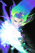
So, from the poll, it seems I'll be drawing Aquagirl. Excellent, good choice everyone. I'll chuck a quick male one here, then, I'll have it so these polls finish in 4 days after I've posted them, meaning I do a man and a woman pretty much every week. Maybe I can keep to that schedule. Who knows?
Lastly, I stumbled across these two things as dress making programs. Yep, I'm pretty sad. Still, I think I made some cool designs using em (well, of course I do. I designed em using what they provided ;))
1 - The first one
2 - The second (and last) one
I think they're pretty cool maker programs, anyone interested in design should give em a go.


I still have the urge to draw now, but no ideas. Plus it's 3:30 in the morning. Fargnuggets (unusual swearing much?)... So yeah, I think I'm gonna go to sleep now, thankyouverymuch.
So, from the poll, it seems I'll be drawing Aquagirl. Excellent, good choice everyone. I'll chuck a quick male one here, then, I'll have it so these polls finish in 4 days after I've posted them, meaning I do a man and a woman pretty much every week. Maybe I can keep to that schedule. Who knows?
Lastly, I stumbled across these two things as dress making programs. Yep, I'm pretty sad. Still, I think I made some cool designs using em (well, of course I do. I designed em using what they provided ;))
1 - The first one
2 - The second (and last) one
I think they're pretty cool maker programs, anyone interested in design should give em a go.


Wednesday, 9 June 2010
Proto cover
No new comic today - instead, you get the proto cover for Knighthood, featuring the five main characters (Omega, Starlite, Gaea, Johhny and EVGA X-18). It's nowhere near finished yet, but I thought I show I haven't been a completely lazy arse today! ;)


Tuesday, 8 June 2010
A contest and two polls
Right, so two things are happening in this post. One relates to my story, and the others relates solely to my drawings. There is a contest to design a character for my story, a chance to decide what superhero you want to be drawn as, and the other is to decide on a character who I'll draw this week as well. Yep, I'm stealing from the wonderfully talented Falisha now. Shock horror! We're all a bunch of thieves here anyway, aren't we?
Part 1 - The 'contest'
In a superpowered world, everyone needs some form of protection. Some are villains, others are just cillivians. Regardless, if you need a job doing, and you need it done with style and so many consequences, you can totally hire, The. Seven. Deadly. Sins. All are deadly killers, if you are in need of such a task. They are bodyguards, mercenaries, former military and child soldiers. They'll accept any task, so long as you pay them.
Listed below are 5 of the 7 Sins. All are related to their Sin name in some way, albeit either inverse or completely in line. Come up with a character, and it may be put in. Just no silly characters - this is a serious group, for serious people, in a serious England, on a serious Earth...
Pride
Leonard Prisky
Muscular black male, gauntleted hands with half finger gloves, armoured vest and t-shirt, armoured boots, sword on back, guns on hips, knives in holsters around forearms
Leader of the group
Biological nanobots provide enhanced strength, resilience, stamina, senses and total recall
Greed
x
x
x
Lust
x
Busty white female, flowy but revealing costume
Wields a bow with poisoned arrows
Envy
x
x
x
Gluttony
The Mannequin
Thin figure white male, completely covering costume, clear data input helmet
Four additional arms with web shooting capabilities, mind control through his dolls with the targets DNA on
Wrath
X
Standard figure white female, sensible flight costume, slightly flowy but sealed trousers, armoured torso, mechanical legs and wings for flight, with additional tail, four breather tubes going to backpack
Slight combustion powers
Sloth
x
Standard figure black female, tight full costume with half finger and open palm gloves, green leather with darker green highlights
Power, memory and skill absorption through touch
Part 2 - The first poll
Simple enough - provide a picture of yourself, or a description if you'd prefer, and a superhero/villain you want to be. Then I'll draw it. Simples
Part 3 - The second (and final) poll
What character should I draw? They're listed on the right, shame I can't get the pictures on em :( Ah well, ya win some, you loose some...
Temporialis - 4

- Temporialis - part 1 - page 4 - Tuesday 8th June 2010 - 5:15 pm -
Viewable on DeviantArt as well [here]
Commentary
Well then, today is brought to you by the letter S. As is sorry for slipping up, being shit at keeping to a schedule, and just generally be rubbish at this whole comic thing... Not that anyone reads the comic anyway, and therefore nobody reads the apology, and therefore nobody cares. Wahehy! As you can tell, I'm in a bit of an apathetic/feeling crappy mood. Oh well, sometimes it happens. I'm sure it's just the fact I don't have a job, and will be sitting on my arse for many months... Quite possibly that.
Anywho, I digress. On to the important stuff, like the commentary. Yes, this one is a bit of a rush job, and I may or may not get the last part of the Temporialis intro out today as well (here's hoping). I jus don't know yet. And yep, this does delay Knighthood, but hey. That's generally how it goes around here. Of course, I'm quite tempted to just write Temporialis and Knighthood, and leave Vampire's Reign for the time being. I have a guest artist who is going to do a couple of pages for that one, so I'm tempted to alternate between those two, and Night Watch instead. Just see how it goes and all that. But this last week and a bit wasn't the best time to start doing the comic really - preparing and entering a Warhammer 40K tournament over the weekend, up in Nottingham, well, kinda hard to do a comic along with that...
On the comic itself, you may have noticed that I can't truly define Skeletron right now - I have the idea in my head, but the idea doesn't include shoulder width description, so I'm still experimenting with it atm. The third/fourth panel I'm really not happy with. I feel it's a good idea with a bad execution - it's meant to show Skeletron talking to Herbert, crossing sides, and as his face disappears behind Herbert when we look behind him, his face changes to what Herbert is seeing of him. This is because Skeletron wears a holographic device that makes him look human. I'll explain more about this in the actual comic, but suffice to say, as the dialogue implies, he hasn't been like this for too long. It's new, he's getting used to it, roadtesting his new body. Hopefully you got that in the comic itself...
I'm actually quite proud of the second panel depiction of Skeletron - I think it's a winner when it comes to his basic design and proportions. Of course the design itself is still pretty damn hard for me to illustrate, but I think I'm getting there. Hopefully the page meant sense, and my laziness didn't impact too much on the story. Let me know, I really need the feedback on everything here.
Thanks for reading everyone
Thursday, 3 June 2010
Temporialis - 3

- Temporialis - part 1 - page 3 - Thursday 3rd June 2010 - 9:50 am -
Viewable on DeviantArt as well [here]
Commentary
Yep, I slipped up again. Well, I'm getting used to this schedule, so it's bound to be cacked up in the first week or two. Still, I'm already improving it - just like how I paint, I like breaks in the middle of the drawing. I'll be doing some in the morning, then finishing it off in the evening and posting it then. We'll see how that goes, and whether it works. I expect it'll be better once the tournament is done, and I won't be traveling to my friends house. Instead, I'll just be drawing and being a lazy bum.
Now, I know what I said yesterday about backgrounds, but I'm really not doing very well with the whole schedule thing, and was getting quite fed up with drawing last night. Not at all happy with 'yesterdays' page, not one bit... Still, at least I did it I suppose.
This page was an odd one anyway, as it was the last page I scripted, but the third I drew. I'm just not a fan of fight scenes. I'm terrible at drawing them, and unless they're really well done, they just seem like padding to me...
Now, pay attention to the symbol on the guy's back - this isn't important in it's own right, but I'm giving everyone a free notice at a Lantern Corps reference. There will be others, along with other DC/Marvel/Dynamite/other webcomic references.
Anywho, I can't really concentrate any more. There's builders in the house, and it's damn noisy...
Wednesday, 2 June 2010
Temporialis - 2

- Temporialis - part 1 - page 2 - Wednesday 2nd June 2010 - 11:20 am -
Viewable on DeviantArt as well [here]
Commentary
Ok, so yeah, I've already slipped on my schedule. Suffice to say yesterday was very busy, traveling between separate places, back and forth. Anywho, today is better, I got my scheduling sorted out. Anyway, since I missed yesterdays, you do still get todays as well. That'll be up in the evening, with it's own commentary. Promise.
On the actual comic itself, well, this went through alot of revision. Originally 5 panels, and in a completely different layout to how it actually ended up being, this is something I'm learning when scripting and drawing a comic. It gives me a feel of both ends, and therefore I become a better writer - knowing where panels look better bigger or smaller, which ones make the better action shots - that kind of thing. Of course, it's still not perfect. Panel one is kndof redundant, what with it being highly similar to panel 4 of page 1. But hey, I'm still learning. And yes, I know I cocked up the fourth panel of this page. It was meant to be a zoom shot, and I just completely cocked it up, 'timesuit man' (names generally come to me during the post production process, which isn't a good habit when you think about it) and all. I'm sorry
When I wrote the script for this issue, I figured it would be in colour, and so the box-outs would be in different colours. Now, due to me now not colouring them, I needed a new representation. Obviously little pictures are the classic solution, but being at half a cm wide, they're a bit too big. It's a learning curve, and you'll see this comic evolve along with my ability to both write and draw it.
Now, I'm not sure how regular comic/web-comic artists do backgrounds, but I feel they're best left till last, as they aren't as important as the foreground stuff, where all the action takes place (obviously). But some artists on the web do cop out a little, which is a shame. I understand perspective can be hard, but it really does give you a feel of where you are, even if it's just small things. I'm terrible at them myself, but I feel the area I designed has enough 'action' in the background as it is. Plus I do leave huge areas of blank space, as I'm just not that good at the whole design an environment thing. People, yeah, sure thing. Places, well, erm... Not so hot on.
Oh, and I'm hating drawing that chair and bookcase. I wish I'd never put em in here... And I'm sure it's highly inaccurate of German design during the Third Reich, but, well, the sticklers who really love historical accuracy will just have to deal with it. As I'm more of a mythological accuracy (if such a thing exists) kind of person myself.
Subscribe to:
Posts (Atom)